Are you someone who pours milk first, then cereal? Or do you pour cereal first, then milk?
It’s a tiny decision, but it completely changes how your breakfast feels. How long the cereal stays crunchy, how evenly it mixes, and even how satisfying that first bite is.
That’s exactly how copy works in UX.
It may seem like a minor detail, but the placement and tone of your words – whether it’s a button label, a tooltip, or an onboarding message – can make or break the user experience. When words are used intentionally, they guide. When they’re not, users feel confused, lost, or worse, they leave.
In this article, we’ll explore why copywriting in UX isn’t just about better words but more about better experiences.
What Is UX Copywriting, Really?
If someone asked me to explain UX copywriting in one picture, I’d show them this:

Yes, it’s a meme. But also, doesn’t it hit the mark?
That oversized oil bottle represents how copywriting can completely overwhelm design when used carelessly. It’s a funny exaggeration, but it makes a powerful point: just like too much oil ruins a salad, overused or poorly placed copy can ruin a perfectly good interface.
So, is your copy enhancing your UX, or drowning it?
Why Is Copywriting Crucial in UX?
What milk is to cereal, copywriting is to UX.
You might have a beautiful website with stunning visuals, but if your words don’t connect with your users, it’s like eating dry cereal; crunchy, confusing, and maybe even a choking hazard.
Words are the layer that makes design digestible.
And yet, copy is often the most overlooked part of the design process. Here’s the thing: your words are not decoration. They’re a direction. Without thoughtful copy, users won’t just be unsure → they’ll leave.
If UX Is the Wedding, Copy Is the Speech
Let’s say you’re giving a speech at your best friend’s wedding. Would you mumble three lines and let a video montage do the talking?
Of course not. You’d show up with heart, intention, and personal stories.
That’s what copy does for UX. A great design might impress visitors, but great copy makes them stay. If design is the fancy wedding venue, copy is the heartfelt speech that makes people laugh, cry, and remember the moment.
Design draws them in. Copy seals the connection.
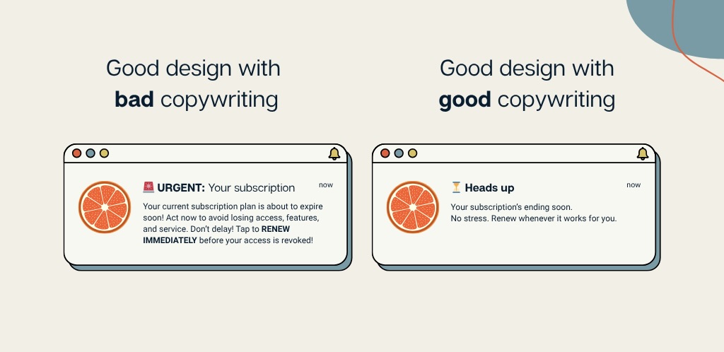
Clarity Drives Action
One of the biggest mistakes in UX copywriting is trying too hard, using too many adjectives, jargon, or flowery phrases that add friction instead of flow.
Let’s look at this example:
❌ “We are the only platform where we provide cutting-edge analysis of bla bla bla software that helps you speed up your work.”
That’s a mouthful, and your users stopped reading halfway.
Now, try this:
✅ “Speed up your workflow. Make better decisions, faster.
Let us help you break down the analysis of bla bla bla software.”
Shorter sentences. Clearer value. Less noise. That’s how copy earns its keep.
Emotional Connection > AI-Generated Text
Have you ever read a paragraph and felt that a 7th grader could write better than this AI-tool on autopilot?
Chances are, your users feel that, too.
AI can be great for speed, but not for the soul. The way you write, talk and communicate with your users is not what AI would be able to do. For instance, AI might say:
“Get started with our software today and earn customers.”
But you could say:
“Start today—because your future customers are already out there, looking for the solution you’re about to offer.”
That’s the smart human side doing the talking. Don’t lose it.
Copy Shapes, Flow, and Navigation
Think about how frustrating it is to read a clunky paragraph and still not find the information you actually need. Poor wording is one of the biggest barriers to a great user experience.
Your copy should stand out just as much as your design, not compete with it. That means using clear, powerful language, an intuitive flow of information, and making sure everything from fonts and colors to white space works together, not against each other.
One of the best things you can do? Think like your user.
Ask yourself: If I were buying this product, what would I need to know? What would I want to feel confident about before clicking “Buy”?
Then, test it. Ask a friend or cousin to use your product without context. Their confusion will show you what your copy failed to explain.
When UX Copy Goes Wrong
Great UX copy quietly builds trust — it reassures users, guides them effortlessly, and makes them feel like they’re in good hands.
Bad copy, on the other hand, leaves people scratching their heads, wondering, “Wait… what does this company even do?”
These are some UX copy crimes I avoid like the plague — and you should too:
- Too much technical jargon: You’ve probably scrolled through so many competitor websites that you’ve accidentally started sounding like them, assuming that what worked for them will work for you, too. But here’s the thing: your users are not here to be impressed by how technical or “clever” you sound. They want to know what you can actually do for them. So save the jargon for the backend work and talk to your audience like you would if you were a university professor explaining something to a student: clear, confident, and human.
- A robotic, lifeless tone: Just because others are using the Oxford-style language doesn’t mean you have to. In a world full of AI-generated blah-blah, sounding human is a competitive advantage. This is your chance to be different; don’t waste it trying to sound “corporate.”
- A mismatch between tone and design: If your website looks stunning, with sleek visuals and modern UI, then don’t ruin it with copy that’s trying “too hard.” Let the design breathe. If the visuals have said enough, your words should whisper, not shout. Overexplaining makes your brand feel like a chatterbox that doesn’t know when to stop.
Remember, words and visuals should be like siblings, not awkward step-siblings. If you’re just pasting in generic, auto-generated copy without any context, you’re actively breaking the experience.
Takeaways: How to Improve UX Through Better Copywriting
Good UX is a treat for the eyes, and good copy is a treat for the brain. Together, they create a seamless, memorable experience that keeps users coming back for more.
Think of your website like a movie. You wouldn’t cast incredible actors only to give them cringeworthy dialogue, right? The best scenes — the ones that get shared, quoted, and turned into memes — have great lines. That’s what copy does for your design. It gives it life.
So if you’re building a website or product, make sure:
- It reads like a human, not a robot, just as much as it looks good.
- It’s short, helpful, and actionable — every word earns its place.
- The tone and design speak the same language → visually and verbally aligned.
Always step into your user’s shoes. If it doesn’t feel good or sound right from their point of view, it’s time to tweak.